Service Update - Improved Applicants Table
What's New at SmarterSelect
The new an improved Applicants table!
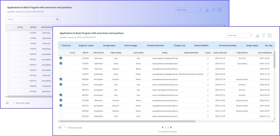
Applicants Table: Great new changes
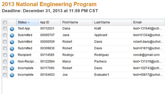
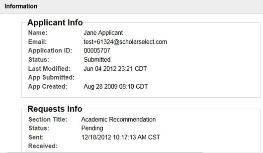
We’ve cleaned up our Applicants table substantially. First of all, we removed some extraneous columns to give it a cleaner look and make it easier to find your information. We’ve also added the Quick View icon in the left-most column. Clicking this will bring up a lightbox that displays detailed information about a specific application, clearly sorted and more organized than ever!
where is the Requests column?
We’ve replaced the Requests column with a lightbox that will actually give you far more detailed information about each request associated with an application. We wanted to make sure that you were getting the most comprehensive data, and putting that in the table just wasn’t working as well. Now all the details are displayed on a separate page that you can bring up at a moment’s notice– enjoy!
Applicants table changes Q&A
How do I find out when an application was last modified or submitted?
Just click the Quick View icon (the little blue circle with the magnifying glass). A lightbox will appear and display all of that information for you!
What’s with all the changes to the Applicants table? I liked it before!
We liked it too– we just thought that it took too long to load, and it was a little cumbersome. We wanted to make sure that everyone had a short load time as well as all the information that they needed, neatly organized and easy to reach, and this was the best solution!
Can I still do all the same things that I could do before the change?
Absolutely! We haven’t taken away any of the functionality– we just cleaned it up a little bit. You can see even more detailed information about the Requests now, without having to navigate away from the Applicants table. So really, you can do even more than you could do before we changed the table!


