New UI - Why We Made the Change
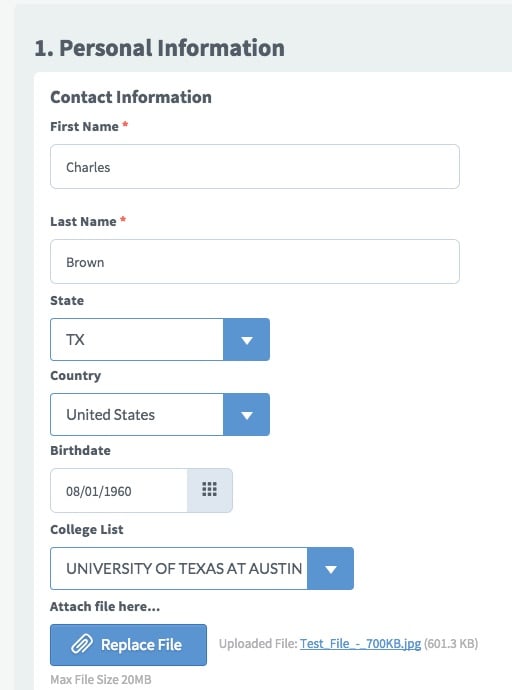
The new user interface is here! The new user interface is here!
So, you're asking, "Why the heck did you guys do this?"
We starting planning for an updated UI (user interface) way back in 2013 as we detected that more and more users of the SmarterSelect service were using tablets and smartphones. Additionally, a Pew Research Center report found that 85 percent of mobile phone owners in the 18-29 age group use their handset to go online and nearly half of those users say that it is their primary device for the Internet.
Although our prior UI operated pretty well on tablets and smartphones, we wanted to take advantage of newer technologies that are mobile responsive. In other words, the web pages adjust based on the screen size of device used. Also, the new technologies give us a better platform for implementing new features and improvements. And frankly, we thought new UI looks just darn cooler!
So, what's next? We still need to fix and tweak a few items here and there in the UI. This was a significant effort and we probably missed a few things. Plus, we'd like to adjust some things now that the new UI is in practice. Please let us know via our support site if we missed anything or have any suggestions.
Also, we have some new application printout designs that we will introduce in the next 30 days, so stay tuned!
Click here for the next blog post about the New UI - Applicants and Evaluators.


